Using Blocks
Blocks are the fundamental visual units of a Slack message. Each block type renders as a different UI component (a section of text, a header, a divider, an image, a row of buttons, and so on). A Message is composed of one or more blocks, rendered top-to-bottom.
This page lists every block type supported by slackblocks, with:
- A short description of what the block is for.
- The
slackblocksPython code to construct it. - The JSON payload that's produced.
- A screenshot of how it looks in Slack.
For the reverse mapping — looking up a class by name — see the Blocks reference. For interactive UI bits (buttons, menus, date pickers) that go inside blocks, see Elements.
Section Block
A section is one of the most flexible blocks available - it can be used as a simple text block, or with any of the available block elements.
Section blocks can also optionally be given an "accessory," which is typically one of the interactive Elements.
Parameters:
| Name | Type | Description | Default |
|---|---|---|---|
text
|
TextLike | None
|
text to include in the block. Can be a string or |
None
|
block_id
|
str | None
|
you can use this field to provide a deterministic identifier for the block. |
None
|
fields
|
TextLike | list[TextLike] | None
|
a list of text objects. One of either |
None
|
accessory
|
Element | None
|
an optional Element object
that will take a secondary place in the block (after or to the side of |
None
|
Throws
InvalidUsageError: if any of the provided arguments fail validation checks.
classmethod
from_dict(data)
Parse a Slack section block payload.
Round-trips text and fields. Raises NotImplementedError
if an accessory is present, because the accessory is an
Element and Element.from_dict is not yet implemented
(Phase 7.4b).
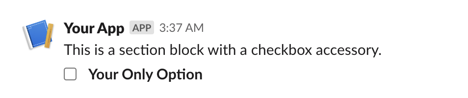
from slackblocks import CheckboxGroup, Option, SectionBlock

SectionBlock(
    text="This is a section block with a checkbox accessory.",
    block_id="fake_block_id",
    accessory=CheckboxGroup(
        action_id="checkboxes-action",
        options=[
            Option(
                text="*Your Only Option*",
                value="option_one"
            )
        ]
    )
)
{
    "type": "section",
    "block_id": "fake_block_id",
    "text": {
        "type": "mrkdwn",
        "text": "This is a section block with a checkbox accessory."
    },
    "accessory": {
        "type": "checkboxes",
        "options": [
            {
                "text": {
                    "type": "mrkdwn",
                    "text": "*Your Only Option*"
                },
                "value": "option_one"
            }
        ],
        "action_id": "checkboxes-action"
    }
}
Rich Text Block
A RichTextBlock is used to provide easier rich text formatting
than standard markdown text (e.g. in a
SectionBlock)
and access to text formatting features not available in traditional
markdown (e.g. strikethrough). See the various rich text elements
you can include here.
Parameters:
| Name | Type | Description | Default |
|---|---|---|---|
elements
|
RichTextObject | list[RichTextObject]
|
a single rich text element or a list of those elements. |
required |
block_id
|
str | None
|
you can use this field to provide a deterministic identifier for the block. |
None
|
Throws
InvalidUsageError: if the elements in elements are not valid rich
text elements.
classmethod
from_dict(data)
Parse a Slack rich_text block payload.
Currently raises NotImplementedError because the rich-text
object hierarchy has a deeply nested element graph; round-tripping
is deferred to Phase 7.4c.
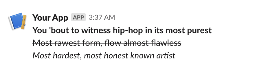
from slackblocks import RichTextBlock, RichTextSection, RichText

RichTextBlock(
    RichTextSection(
        [
            RichText(
                "You 'bout to witness hip-hop in its most purest",
                bold=True,
            ),
            RichText(
                "Most rawest form, flow almost flawless",
                strike=True,
            ),
            RichText(
                "Most hardest, most honest known artist",
                italic=True,
            ),
        ]
    ),
    block_id="fake_block_id",
)
{
    "type": "rich_text",
    "block_id": "fake_block_id",
    "elements": [
        {
            "type": "rich_text_section",
            "elements": [
                {
                    "type": "text",
                    "text": "You 'bout to witness hip-hop in its most purest\n",
                    "style": {
                        "bold": true
                    }
                },
                {
                    "type": "text",
                    "text": "Most rawest form, flow almost flawless\n",
                    "style": {
                        "strike": true
                    }
                },
                {
                    "type": "text",
                    "text": "Most hardest, most honest known artist\n",
                    "style": {
                        "italic": true
                    }
                }
            ]
        }
    ]
}
Header Block
A Header Block is a plain-text block that displays in a larger, bold font.
Parameters:
| Name | Type | Description | Default |
|---|---|---|---|
text
|
str | Text
|
the text that will be rendered as a heading. |
required |
block_id
|
str | None
|
you can use this field to provide a deterministic identifier for the block. |
None
|
classmethod
from_dict(data)
Parse a Slack header block payload.
from slackblocks import HeaderBlock

HeaderBlock(
    "This is a header block",
)
{
    "type": "header",
    "text": {
        "type": "plain_text",
        "text": "This is a header block",
        "emoji": true
    }
}

Markdown Block
Displays formatted Markdown text. Unlike the mrkdwn text style used in
SectionBlock,
MarkdownBlock uses GitHub-flavored Markdown for richer formatting,
including features like tables and code blocks. Added to Slack in 2024
for AI / agentic app outputs.
See: https://api.slack.com/reference/block-kit/blocks#markdown.
Parameters:
| Name | Type | Description | Default |
|---|---|---|---|
text
|
str
|
the Markdown-formatted text to display (1-12000 characters). |
required |
block_id
|
str | None
|
you can use this field to provide a deterministic identifier for the block. |
None
|
Throws
LengthError: if text is empty or longer than 12000 characters.
classmethod
from_dict(data)
Parse a Slack markdown block payload.
Slack added the markdown block type in 2024, primarily for AI / agentic apps. Unlike the mrkdwn text inside a Section Block, MarkdownBlock renders GitHub-flavored Markdown, supporting tables, code blocks, and richer list semantics.
text is required (1 - 12,000 characters).
from slackblocks import MarkdownBlock

MarkdownBlock(
    text="**Hello!** Markdown blocks support _GitHub-flavored_ syntax.",
)
{
    "type": "markdown",
    "text": "**Hello!** Markdown blocks support _GitHub-flavored_ syntax."
}
See the Slack reference for the supported Markdown features.
Image Block
An Image Block contains a single graphic, accessed by URL.
Parameters:
| Name | Type | Description | Default |
|---|---|---|---|
image_url
|
str
|
the URL pointing to the image file you want to display. |
required |
alt_text
|
str | None
|
alternative text for accessibility purposes and when the image fails to load. |
' '
|
title
|
Text | str | None
|
an optional text title to be presented with the image. |
None
|
block_id
|
str | None
|
you can use this field to provide a deterministic identifier for the block. |
None
|
Throws
InvalidUsageError: when one or more of the provided args fails validation.
classmethod
from_dict(data)
Parse a Slack image block payload.
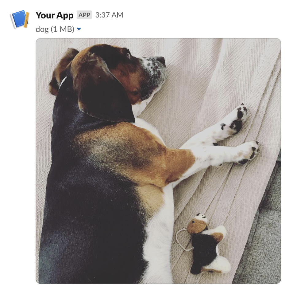
from slackblocks import ImageBlock

ImageBlock(
    image_url="https://api.slack.com/img/blocks/bkb_template_images/beagle.png",
    alt_text="a beagle",
    title="dog",
    block_id="fake_block_id",
)
{
    "type": "image",
    "block_id": "fake_block_id",
    "image_url": "https://api.slack.com/img/blocks/bkb_template_images/beagle.png",
    "alt_text": "a beagle",
    "title": {
        "type": "plain_text",
        "text": "dog"
    }
}
Input Block
A block that collects information from users - it can hold a plain-text input element, a checkbox element, a radio button element, a select menu element, a multi-select menu element, or a datepicker.
Parameters:
| Name | Type | Description | Default |
|---|---|---|---|
label
|
TextLike
|
the name which identifies the input field. |
required |
element
|
Element
|
an interactive Element (e.g. a text field). |
required |
dispatch_action
|
bool
|
whether the Element
should trigger the sending of a |
False
|
block_id
|
str | None
|
you can use this field to provide a deterministic identifier for the block. |
None
|
hint
|
TextLike | None
|
an optional additional guide on what input the user should provide. |
None
|
optional
|
bool
|
whether this input field may be empty when the user submits e.g. the modal. |
False
|
Throws
InvalidUsageError: when any of the provided arguments fail validation.
classmethod
from_dict(data)
Parse a Slack input block payload.
Currently raises NotImplementedError because the nested
element requires Element.from_dict, which lands in Phase 7.4b.
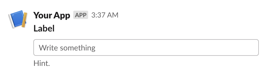
from slackblocks import InputBlock, Text, TextType, PlainTextInput

InputBlock(
    label=Text("Label", type_=TextType.PLAINTEXT, emoji=True),
    hint=Text("Hint", type_=TextType.PLAINTEXT, emoji=True),
    element=PlainTextInput(action_id="action"),
    block_id="fake_block_id",
    optional=True,
)
{
    "type": "input",
    "block_id": "fake_block_id",
    "label": {
        "type": "plain_text",
        "text": "Label",
        "emoji": true
    },
    "element": {
        "type": "plain_text_input",
        "action_id": "action"
    },
    "hint": {
        "type": "plain_text",
        "text": "Hint",
        "emoji": true
    },
    "optional": true
}
Divider Block
A content divider, like an <hr> in HTML, to split up different blocks inside of
a message.
Parameters:
| Name | Type | Description | Default |
|---|---|---|---|
block_id
|
str | None
|
you can use this field to provide a deterministic identifier for the block. |
None
|
classmethod
from_dict(data)
Parse a Slack divider block payload.
from slackblocks import DividerBlock

DividerBlock()
{
    "type": "divider"
}

File Block
Displays a remote file (e.g. a PDF).
For details on how remote files are exposed to Slack, see https://api.slack.com/messaging/files#adding.
Parameters:
| Name | Type | Description | Default |
|---|---|---|---|
external_id
|
str
|
the ID assigned to the remote file when it was added to Slack. |
required |
block_id
|
str | None
|
you can use this field to provide a deterministic identifier for the block. |
None
|
source
|
str
|
always "remote" as per the Slack API (may change in the future). |
'remote'
|
classmethod
from_dict(data)
Parse a Slack file block payload.
from slackblocks import FileBlock

FileBlock(
    external_id="external_id",
    block_id="fake_block_id",
)
{
    "type": "file",
    "external_id": "external_id",
    "source": "remote",
    "block_id": "fake_block_id"
}
 * Note that this example comes from the Slack Web API docs.
Context Block
A ContextBlock displays contextul message info, including both images and text.
Parameters:
| Name | Type | Description | Default |
|---|---|---|---|
elements
|
list[Element | CompositionObject] | None
|
a list of |
None
|
block_id
|
str | None
|
you can use this field to provide a deterministic identifier for the block. |
None
|
Throws
InvalidUsageError: when items in elements are not Text or Image or exceed 10 items.
classmethod
from_dict(data)
Parse a Slack context block payload.
Text elements within the block are parsed back to Text; image
elements raise NotImplementedError because Element.from_dict
has not yet shipped (Phase 7.4b).
from slackblocks import ContextBlock, Text

ContextBlock(
    elements=[
        Text("Hello, world!"),
    ],
    block_id="fake_block_id"
)
{
    "type": "context",
    "block_id": "fake_block_id",
    "elements": [
        {
            "type": "mrkdwn",
            "text": "Hello, world!"
        }
    ]
}

Actions Block
A Block that is used to hold interactive elements (normally for users to interface with).
Parameters:
| Name | Type | Description | Default |
|---|---|---|---|
elements
|
list[Element] | None
|
a list of Elements (up to a maximum of 25). |
None
|
block_id
|
str | None
|
you can use this field to provide a deterministic identifier for the block. |
None
|
Throws
InvalidUsageError: if any of the items in elements are invalid.
classmethod
from_dict(data)
Parse a Slack actions block payload.
Currently raises NotImplementedError because round-tripping
depends on parsing nested elements; Element.from_dict will land
in Phase 7.4b.
from slackblocks import ActionsBlock, CheckboxGroup, Option

ActionsBlock(
    block_id="fake_block_id",
    elements=CheckboxGroup(
        action_id="actionId-0",
        options=[
            Option(text="*a*", value="a", description="*a*"),
            Option(text="*b*", value="b", description="*b*"),
            Option(text="*c*", value="c", description="*c*"),
        ],
    ),
)
{
    "type": "actions",
    "block_id": "fake_block_id",
    "elements": [
        {
            "type": "checkboxes",
            "action_id": "actionId-0",
            "options": [
                {
                    "text": {
                        "type": "mrkdwn",
                        "text": "*a*"
                    },
                    "value": "a",
                    "description": {
                        "type": "plain_text",
                        "text": "*a*"
                    }
                },
                {
                    "text": {
                        "type": "mrkdwn",
                        "text": "*b*"
                    },
                    "value": "b",
                    "description": {
                        "type": "plain_text",
                        "text": "*b*"
                    }
                },
                {
                    "text": {
                        "type": "mrkdwn",
                        "text": "*c*"
                    },
                    "value": "c",
                    "description": {
                        "type": "plain_text",
                        "text": "*c*"
                    }
                }
            ]
        }
    ]
}
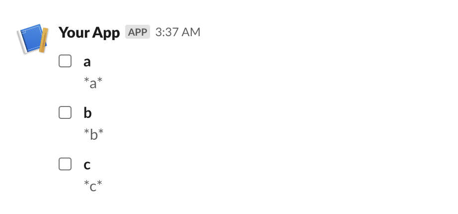
Table Block
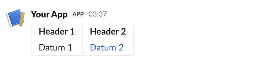
A TableBlock displays data in a table format.
Parameters:
| Name | Type | Description | Default |
|---|---|---|---|
rows
|
list[list[RawText | RichTextObject]]
|
a list of lists of |
required |
column_settings
|
list[ColumnSettings] | None
|
a list of |
None
|
block_id
|
str | None
|
you can use this field to provide a deterministic identifier for the block. |
None
|
Throws
InvalidUsageError: when items in rows are not RawText or RichTextObject objects.
InvalidUsageError: when the number of column_settings does not match the number of
columns in each row.
InvalidUsageError: when the number of rows is greater than 100.
InvalidUsageError: when the number of columns in a row is greater than 20.
InvalidUsageError: when the number of column_settings is greater than 20.
classmethod
from_dict(data)
Parse a Slack table block payload.
Currently raises NotImplementedError because table cells may
contain rich-text objects whose round-trip parser is deferred to
Phase 7.4c.
from slackblocks import (
    ColumnSettings,
    RawText,
    RichText,
    RichTextLink,
    RichTextSection,
    TableBlock,
)

TableBlock(
    column_settings=[
        ColumnSettings(align="right", is_wrapped=True),
        ColumnSettings(align="left"),
    ],
    rows=[
        [
            RichTextSection(
                elements=[RichText(text="Header 1", bold=True)],
            ),
            RichTextSection(
                elements=[RichText(text="Header 2", bold=True)],
            ),
        ],
        [
            RawText(text="Datum 1"),
            RichTextSection(
                elements=[
                    RichTextLink(
                        url="https://slack.com",
                        text="Datum 2",
                    )
                ],
            ),
        ],
    ],
)
{
    "blocks": [
        {
            "type": "table",
            "rows": [
                [
                    {
                        "type": "rich_text",
                        "elements": [
                            {
                                "type": "rich_text_section",
                                "elements": [
                                    {
                                        "type": "text",
                                        "text": "Header 1",
                                        "style": {
                                            "bold": true
                                        }
                                    }
                                ]
                            }
                        ]
                    },
                    {
                        "type": "rich_text",
                        "elements": [
                            {
                                "type": "rich_text_section",
                                "elements": [
                                    {
                                        "type": "text",
                                        "text": "Header 2",
                                        "style": {
                                            "bold": true
                                        }
                                    }
                                ]
                            }
                        ]
                    }
                ],
                [
                    {
                        "type": "rich_text",
                        "elements": [
                            {
                                "type": "rich_text_section",
                                "elements": [
                                    {
                                        "type": "text",
                                        "text": "Datum 1"
                                    }
                                ]
                            }
                        ]
                    },
                    {
                        "type": "rich_text",
                        "elements": [
                            {
                                "type": "rich_text_section",
                                "elements": [
                                    {
                                        "type": "text",
                                        "text": "Datum 2"
                                    }
                                ]
                            }
                        ]
                    }
                ]
            ]
        }
    ]
}
Video Block
Embeds a video. Used to display video content inside a Slack message, modal, or App Home tab.
See: https://api.slack.com/reference/block-kit/blocks#video.
Note: Slack restricts which domains may be embedded. The server-side
whitelist (e.g. YouTube, Vimeo) is enforced by Slack on receipt of the
payload, not by this library; supplying an unsupported URL will result
in a Slack API error rather than an InvalidUsageError at construction.
Parameters:
| Name | Type | Description | Default |
|---|---|---|---|
alt_text
|
str
|
a plain-text summary of the video, used for accessibility and notifications (max 200 chars). |
required |
thumbnail_url
|
str
|
a URL pointing to the preview image shown before playback. Must be HTTPS in production usage. |
required |
title
|
TextLike
|
the title shown above the video player (plain text, max 200
chars). A |
required |
video_url
|
str
|
the URL of the video to embed. Must point to a Slack-supported provider (see Slack's documentation). |
required |
author_name
|
str | None
|
optional author name shown beneath the video (max 50 chars). |
None
|
block_id
|
str | None
|
an optional deterministic identifier for the block. |
None
|
description
|
TextLike | None
|
optional plain-text description below the video
(max 200 chars). A |
None
|
provider_icon_url
|
str | None
|
an optional URL to the provider's icon. |
None
|
provider_name
|
str | None
|
an optional provider name shown alongside the icon (max 50 chars). |
None
|
title_url
|
str | None
|
an optional URL to link the title to. |
None
|
Throws
LengthError: if any length-constrained string exceeds its limit.
classmethod
from_dict(data)
Parse a Slack video block payload.
Embeds a video from a Slack-supported provider (e.g. YouTube, Vimeo). The title accepts either a str (coerced to plain-text) or a Text instance; description works the same way.
Required: alt_text, thumbnail_url, title, video_url. Slack restricts which domains may be embedded — supplying an unsupported URL will produce a Slack API error rather than an InvalidUsageError at construction.
from slackblocks import VideoBlock

VideoBlock(
    alt_text="How to use slackblocks",
    thumbnail_url="https://example.com/thumb.png",
    title="Getting Started",
    video_url="https://example.com/video.mp4",
    author_name="The slackblocks docs",
    description="A short walkthrough.",
    provider_name="example.com",
    title_url="https://example.com",
)
{
    "type": "video",
    "alt_text": "How to use slackblocks",
    "thumbnail_url": "https://example.com/thumb.png",
    "title": {
        "type": "plain_text",
        "text": "Getting Started"
    },
    "video_url": "https://example.com/video.mp4",
    "author_name": "The slackblocks docs",
    "description": {
        "type": "plain_text",
        "text": "A short walkthrough."
    },
    "provider_name": "example.com",
    "title_url": "https://example.com"
}
See the Slack reference for the full list of optional fields and provider requirements.